What Is a Landscape Picture Style?
And Why It Matters More Than You Think
When you first pick up a camera and switch into “Landscape” mode, it’s easy to assume it’s just another preset. A shortcut for beginners. But the Landscape Picture Style (or Picture Profile, depending on your camera brand) is much more than that — it’s a foundation for how your camera interprets color, contrast, and sharpness. Understanding it can completely change how your images look straight out of camera — and how much editing you’ll need later.
What Exactly Is a Picture Style?
Every camera has a built-in “look” — a way it processes raw sensor data into a final image or preview. That’s your Picture Style. Think of it like a film stock preset baked into your camera.
It controls things like:
Contrast – how deep your shadows and highlights are.
Saturation – how rich or muted your colors appear.
Sharpness – how crisp the details are, especially in textures.
Color tone – how warm or cool the overall image feels.
Canon calls them Picture Styles. Nikon uses Picture Controls. Sony calls them Creative Styles. Fujifilm has Film Simulations. Different names, same idea: each profile gives your image a distinct look before you even touch Lightroom.
The Landscape Picture Style Explained
When you choose Landscape, your camera boosts:
Saturation, especially blues and greens — ideal for skies, foliage, and mountain scenes.
Contrast, to give more punch to midtones and help separate elements in wide shots.
Sharpness, to bring out detail in textures like rocks, grass, and clouds.
The result? A vivid, high-impact image that pops right on your LCD screen — perfect for JPEG shooters or quick social posts.
But here’s the catch: those settings are baked into JPEGs. If you’re shooting RAW (which you should if you’re serious about editing), the Picture Style won’t permanently affect your image. Instead, it’ll influence how your preview looks in-camera and sometimes how your RAW editor initially interprets it.
When (and When Not) to Use It
Use it when you’re shooting JPEGs and want vibrant outdoor colors without much post-processing.
Use it when scouting or composing shots to visualize contrast and depth more clearly.
Avoid it when you plan to grade your images later — the boosted contrast can make it harder to judge exposure accurately.
If you’re filming video, you might want to go the opposite direction — choose a Neutral or Flat style to preserve more dynamic range for color grading.
Crafting Your Own “Landscape Look”
Once you understand what the Landscape Picture Style is doing, you can take control. Custom profiles let you tweak those parameters to match your taste — maybe a softer contrast for misty mountain mornings, or less saturation for moody alpine tones.
Some photographers even create their own Landscape Styles by starting with a neutral base and adjusting color balance and tone curve until it fits their signature look.
That’s how you go from “standard landscape shot” to a recognizable photographic style.
Final Thoughts
The Landscape Picture Style is more than a preset — it’s your camera’s way of interpreting the world’s natural beauty. Whether you embrace it for quick, punchy results or use it as a stepping stone toward developing your own look, understanding it gives you more creative control.
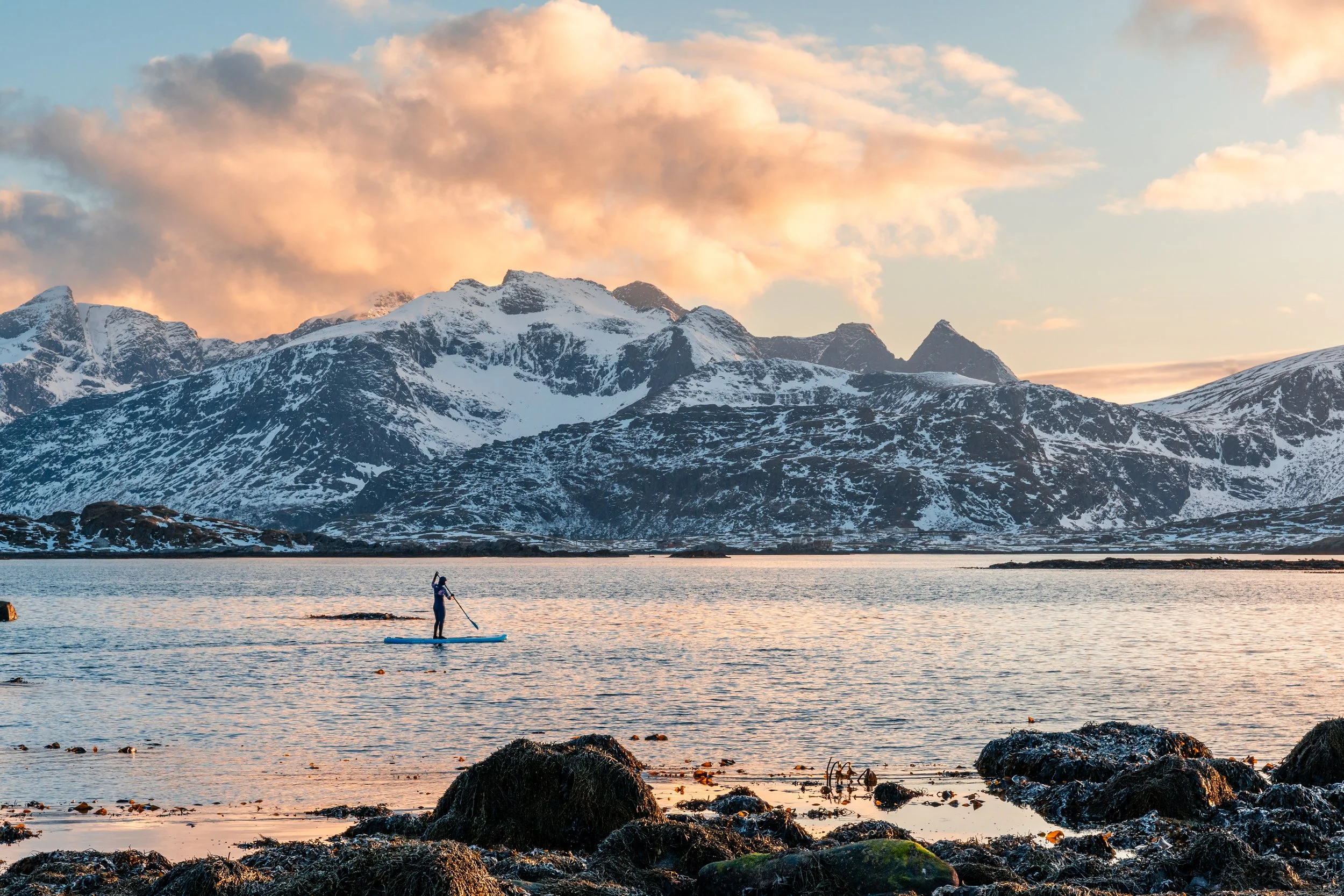
So next time you’re out shooting sunrise over the peaks or a quiet lake reflection, take a moment to think not just about the scene — but about how your camera is translating that scene into color, light, and mood.